JHC
The new vision
Wealth management company JHC offers I.T. solutions to the investment management and stockbroking community. For over 25 years, they have worked closely with clients, helping them to improve the efficiency and competitiveness of their operations by providing an integrated and market-leading range of financial software, consultancy and training services. But in a world where digital technologies moves so fast, how could JHC be able to confront the challenges of the future without a clear vision as a company?
How to add brand value to a company with more than 25 years in the market? During all this time, JHC presented their innovative products as individual characters, leaving their brand always on a secondary level. While their products were highly successful, people hardly knew who JHC was; their vision as a company was very unclear. They never thought about what makes them different from their competitors or why clients decide to use their products instead of the ones from other companies.
Defining that character and asking those questions took the company to a long process of re-discovery. As a brand, they wanted to be perceived as bold, confident and progressive. A brand whose longevity adds an element of trust and transparency, but who looks bravely into the future by being innovative and adaptable.
As an organisation, JHC’s mission was set to provide tools that enable users to manage every aspect of their finances without constrain. That’s the path that JHC will end up taking to achieve their brand vision: Finance without boundaries.
The logo. From the art direction perspective, the main task was taking JHC as a brand back to the front line. And it needed to be done with a logo that boldly represented the new JHC vision. The image, in which the name of the company takes centre stage, conveys strength, confidence and the pioneering nature of the business. The bold typeface suggest that the JHC brand is owned by a substantial and trustworthy entity, while the crisp, clean and modern shapes are a reference to their innovative character.
While the typography brings that strong personality, the JHC ‘dot’ is the one that represents the digital essence of the products and services that JHC offers. It brings something more playful, in contrast with the rigid style of the typeface. On the gradient, once again, the values are present: the blue references the stability of the company while the pink alludes to the creative and innovative side of JHC.

Morphing states of the dot. The JHC logo is not meant to be a static figure. As it moves and morphs, the JHC dot shows how JHC’s products and services enable financial institutions to reshape their operations and grow their businesses. This is a brand constantly in change, expanding, splintering, cracking and growing before returning to its solid, original form. It’s a look into the future and how JHC is facing it, ready to accept the challenge and reshaping following market needs.
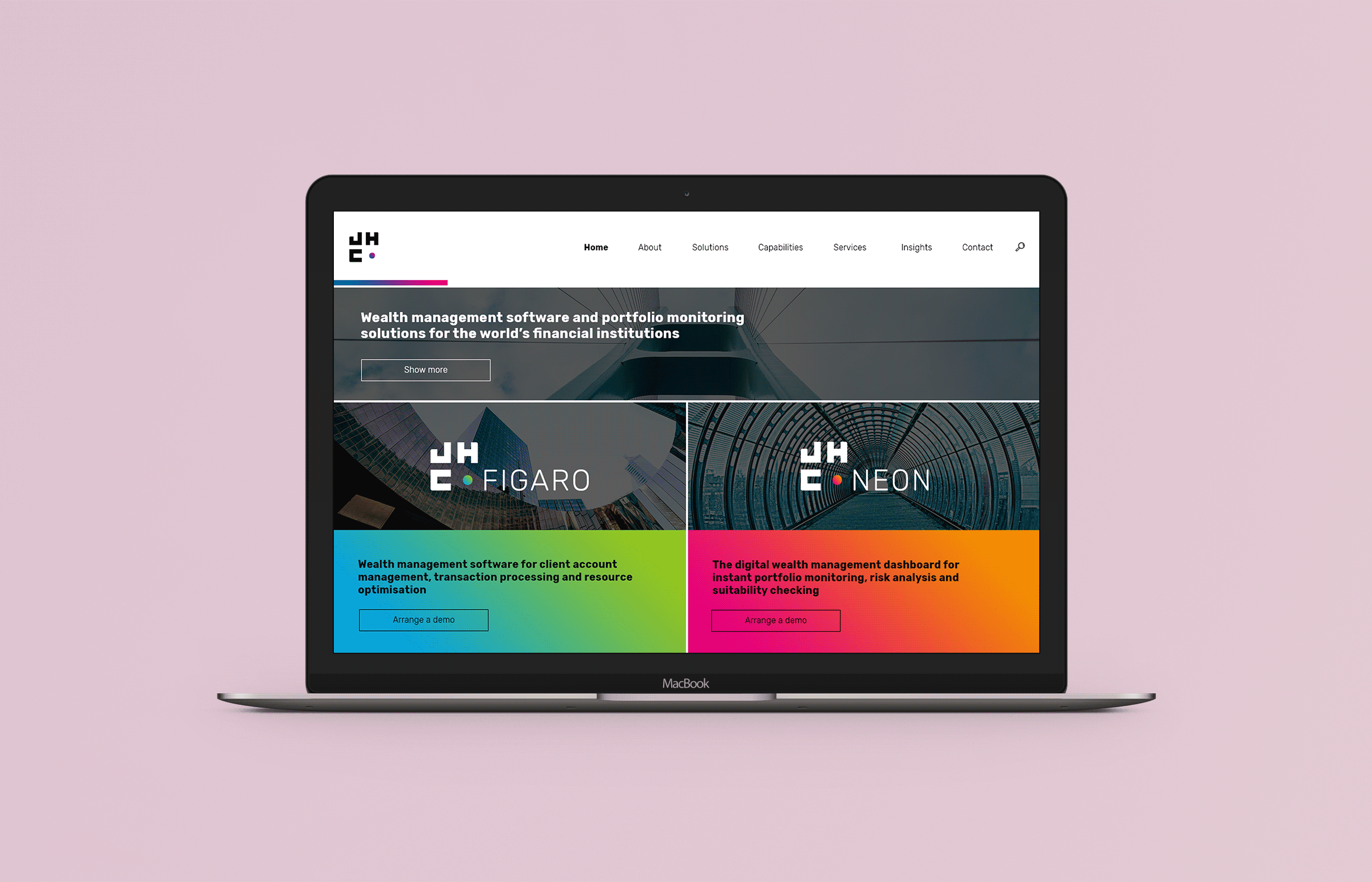
JHC’s products sub-branded. While the old brand lacked consistency and allowed JHC’s products to live on its own environment, these new visuals were created to make a clear connection between product and company. This way, JHC gets more exposure as a brand while all their software is contained under the new vision of the corporation.
For that reason, the logos of all their products were designed keeping a very similar structure and visual composition, working as a sub-brand affiliated to the parent brand. While the products follow the same identity as JHC, the gradient colour of the dot changes on each one, giving a them their own personality, but without forgetting that special connection with JHC.