
Wealth Management company JHC works closely with clients to improve their operational performance of financial services, providing an integrated and market-leading range of software, managed service, consultancy and training services. As a part of the rebrand the company was going through 🔗, JHC asked for a premium corporate brochure to display the re-invigorated values of the company in a way that visually followed their new corporate identity.

Finance without boundaries. Since the start of the rebrand process, the goal was making JHC a company visually more robust and recognisable among their competitors; they wanted to be brave and different. And this corporate brochure was, specifically, the first piece where the company was showing their renovated attitude to the financial world.
By stripping the cover of any image or intricate design, JHC is displaying an open window full of possibilities; it relies entirely on their corporate gradient colour (the logo’s dot), which feels like an important step and an enormous statement coming from the company. That gradient, a decisive part of their identity, takes centre stage, giving JHC the chance to present themselves with determination and proudness. It’s about the company as a brand, with no need of any distraction. It’s about JHC.
The foundations. During the conception of their new corporate identity, how the design of the brochure was going to show their values was something of crucial importance; it needed to break the basic grid. By creating a 7-column layout, the brochure shows more flexibility, allowing the images and copy to flow in many different ways. All the design elements (pictures, dots, boxes and copy) are placed in an apparently arbitrary way around the space, that suggests freedom, potential and choice. But that doesn’t imply chaos whatsoever; the grid transmits that strong structure of a company with more than 20 years in the business. It’s both the foundations of its legacy and the brave future to come.

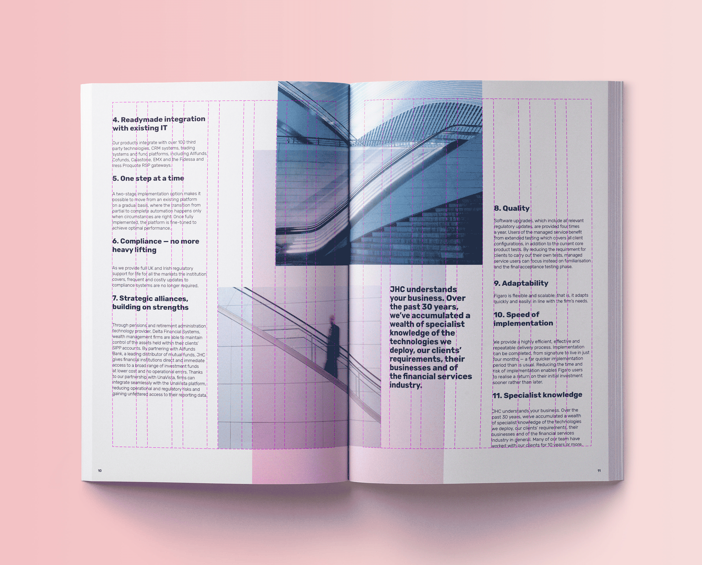
How to illustrate finance. One of the most challenging parts of the brochure was selecting an imagery that allowed JHC to show their core values without being predictable or too literal; they wanted to avoid the use of stereotypically corporate images and the new brand itself was asking for something more audacious. After several ideas were presented, the final decision was using architectural images to convey different characteristics of JHC, like enduring technology, compliance, growth or automation. These images, with its playful and sinuous shapes, work as an interesting counterpoint to the boldness of the new brand, as well as providing an interesting and more metaphorical approach to the financial services world.


