NEVER THE SAME OLD STORY
A rebrand that speaks volumes through bold thinking
Article Ten
The Client
Establishing a Bold New Direction
Article Ten is a London-based creative agency known for delivering high-impact, cross-media campaigns across digital, branding, video, and events. With a new mission to match their evolving ambition, they sought a complete brand transformation—one that would encapsulate their creative range, progressive outlook, and fearless approach to integrated storytelling and fearless design.


The Challenge
Creative Constraints and Challenges
The team’s multidisciplinary nature was a strength—but also a challenge. The identity needed to flex across different formats and media, while never losing cohesion or energy. Equally important was ensuring the new look didn’t feel flat or predictable. The solution? Push hard into expressive typography, unmissable layouts, and a level of vibrancy that visually echoed their spirit of collaboration and momentum.


The Solution
Delivering Bold Versatility
The striking identity system was built around a changing typographic logo—designed to feel confident and unapologetic. Paired with a rich, electrifying palette and bold imagery, the new visual language delivers stand-out presence across all channels. The branding embraces contrast, texture, and rhythm, giving the team a toolbox that adapts to every context without losing its punch. It’s a brand built to be as expressive as the work it represents.


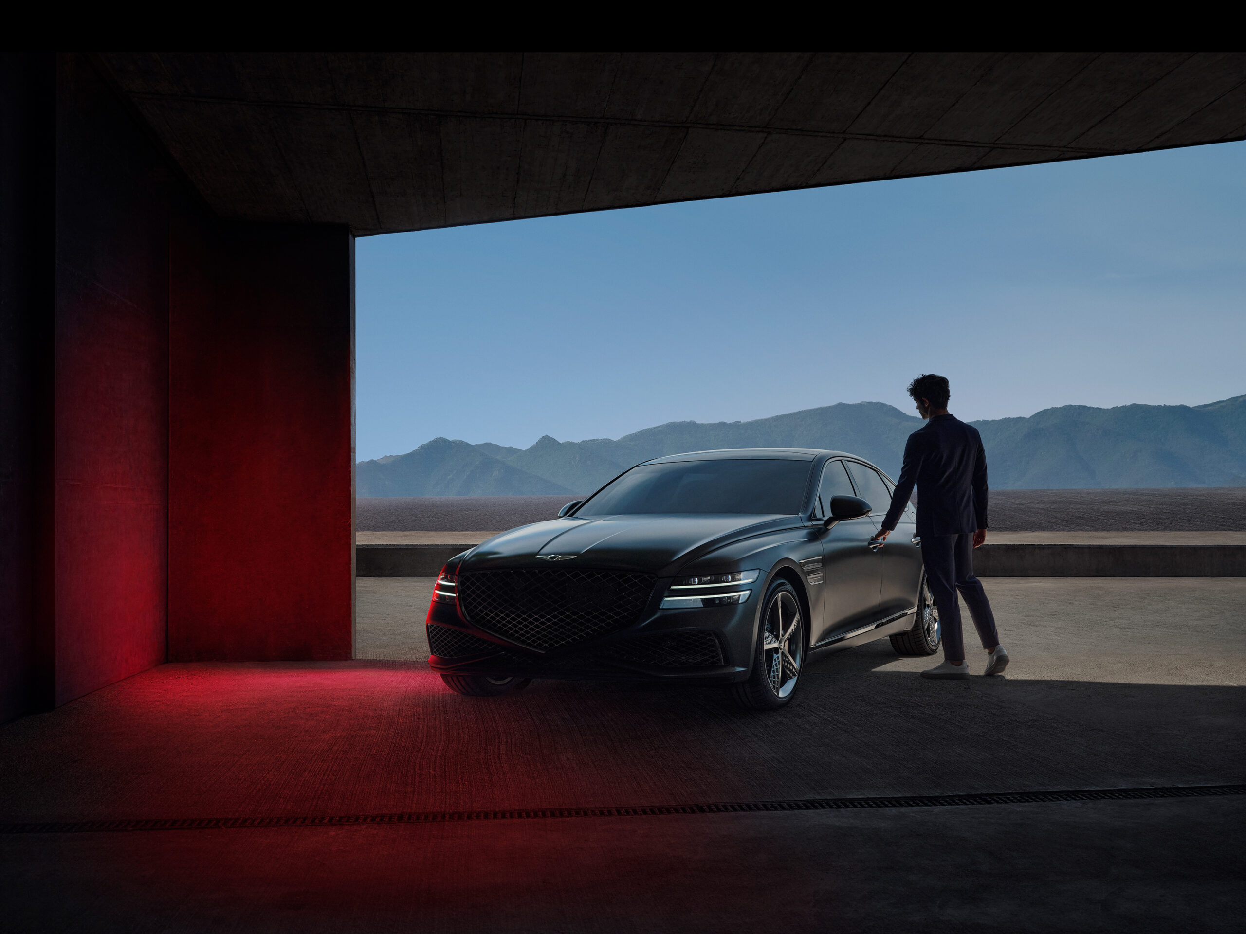
Genesis
Genesis
Raiffeisen Bank
Raiffeisen Bank

NXP
NXP

Avios
Avios

JHC
JHC
Save the Children
Save the Children

BBC
BBC
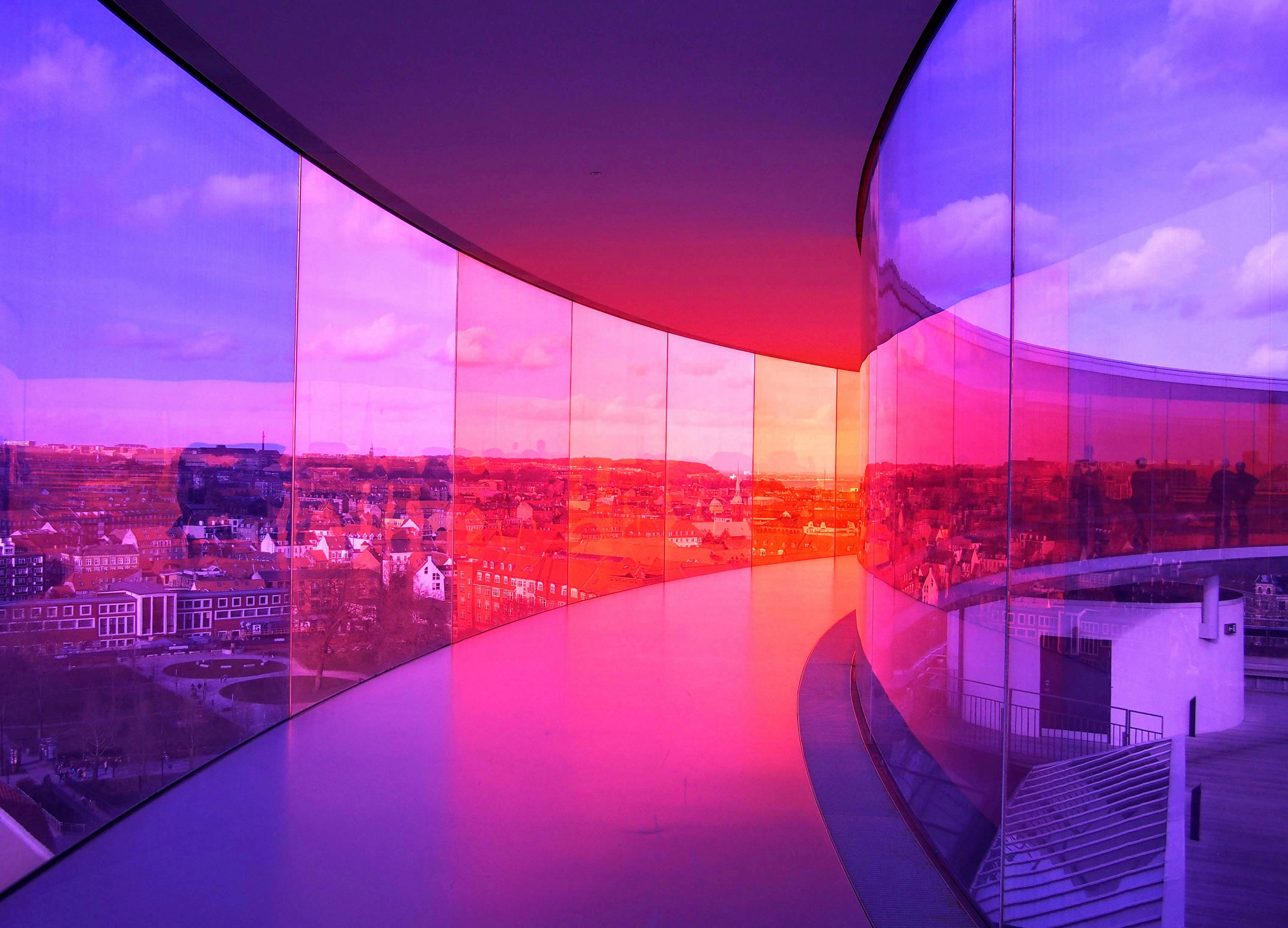
Aarhus 2017
Aarhus 2017
BEN
BEN

XPENG